7 Critical Call to Action Optimization Mistakes That Are Making Your Website Lose Businesses

You have finally created your website after laboring over it for months. The website’s design, layout, and content have been planned and executed perfectly. You have no doubt in your mind that your website will achieve the goals you have dreamed for your business.
But after a few days, there is not much traffic coming on your website’s door. There are even lesser sales conversions. Your website is not faring well at all.
Now you are wondering where you could have gone wrong. You have followed all the rules and put your time and effort into your website, but the results are lackluster at best. It must be driving you up the walls, not knowing what is causing this inactivity.
Well, if this is the scenario you are facing, then there is probably one answer to all your woes. And that is no or very poor use of CTAs (Call to Action). The Call to Action on your website is the one that drives the traffic towards the various actions on your site, which you want your visitors to perform. And if your CTAs are not doing their job, then you will face the obvious problems like less lead generation, email subscriptions, inquiry form submissions, and little or no sales conversions.
So, you need to pay utmost attention to your CTAs as they have the power to convert your visitors to leads and sales, and generate revenues for your business. Take a hard look into why your CTAs are not working as they should. Narrow down the problem areas and fix them as soon as possible. You will see an immediate increase in the number of leads, sales conversions, and finally, the ROI (Return on Investment).
In this article, I am going to highlight the 7 common CTA mistakes that are making your website lose businesses. Besides highlighting the errors, I will also list a few best Call to Action examples along with the best CTA optimization practices.
Call to Action Optimization Mistake #1 – You are Using A Variety of CTAs
Too many choices are not always a good thing. When users get too many options, they feel overwhelmed and give up pretty soon afterward. So, the vital thing to keep in mind is “Less is more’ when it comes to CTAs. Lesser number of choices is equivalent to more conversions.
The famous jam experiment is the best example that showcases how having too much choice can lead to “analysis paralysis” and thus to no conversions.
Do not flood your webpage with too many things to do. Give your visitors a simple and easy way to navigate your landing page while herding them towards a path you want them to follow.
Keep a few specific CTAs towards a goal you want to achieve. If you want users to join a course, then just keep the “JOIN NOW” button and don’t give them any other option to get distracted and pulling away from the main objective.
A fixed goal behind each CTA is a must. Don’t just throw a bunch of CTAs on a landing page just because you can. Determine what you want your visitors to do most on that page and place the related CTA accordingly.
A/B testing comes in handy when you are experimenting to determine which CTA will work best for you. Continuously conduct A/B tests on your CTAs to measure their performance and choose the ones that are resulting in more sales conversions.
Just how people like a tidy home better, website visitors too like a clutter-free webpage that has specific actions to execute without confusing them and driving them away.
So, go and check your webpage, determine which CTAs are necessary and then prune out all the other CTAs which are just in the way. Your conversion rates will increase with just this small action, and your business will be a lot closer to success than it previously was.
Call to Action Optimization Mistake #2 – Your CTA is Not Placed Where It Should Be
Placing a CTA in the right place on a webpage is an essential factor behind its performance. They should be placed in such positions where they are easily visible to your users.
If your users have to work for more than 2 seconds to search for the CTA, then they will lose interest and leave. So, you have always to put your CTA where it grabs the attention of the visitors immediately.
You can either use a text link or a CTA button, but it should be eye-catchy and must stand out from the rest of the page. Put enough white space around a CTA to better draw focus to it along with bolder colors and bigger fonts. There should be no confusion in your visitors’ minds that the CTA would lead them to what they want.
A case study by VWO.com shows that having a prominent CTA button increases conversion by 62 percent.
If you are confused about what type of CTA, a link text or a button, will be more productive, just conduct an A/B test to see which is faring better for you. However, the majority of the experiments indicate that CTA buttons perform better than CTA links.
As for placement, keep an eye on your visitor’s clicking pattern using a heat map tool. Are users not scrolling through your page to reach the CTA? In that case, you can reposition the CTA to a better place which won’t require them to scroll through the entire page to reach it. In general, click-through yield on CTAs above the fold is higher.
There are no specific rules when it comes to CTA placement. Depending on your layout, be sure that your CTA is easily accessible and relevant to the content it is placed around.
Call to Action Optimization Mistake #3 – Your CTA is Getting Lost in The Background
Your CTA location is essential, but along with that, you also have to make sure that they are not getting unnoticed. Most of the time, this happens because they fade in with the background.
The CTAs should be distinguishable from the background. It must pop up to the users. And for doing that, you need to use bold, contrasting colors for your CTA buttons. They should be nice, big, and inviting for the users to click on them.
Here are the few elements you have to keep in mind while designing a CTA button
- Contrast – Utilize the whole color palette and choose the one that pops up the CTA and garners visitors’ attention.
- Bold – Highlight them by bolding.
- Pointer – Use visual cues like arrows to specify the best option and capture the user’s attention.
- Size – Select a bigger size for CTAs you want your users to notice more.
- Placement – Place the most critical CTA above the fold, where it immediately catches the users’ eye.
Call to Action Optimization Mistake #4 – Your CTA Words are Not Persuasive and Exciting
Words have tremendous power when it comes to alluring consumers to do something. Triggering visitors to follow a certain path on your website or urging them to take assertive actions all depends on the words you use on your Call to Action.
So be specific with your words while framing your CTAs. Here are a few points to guide you in this process.
- Don’t use generic words – Don’t use boring, generic words like “submit”, “complete”, “like” etc. Go for exciting words instead like “Try for Free”, “Get Started”, “Join Us” etc.
- Use the magic words – Use “You”, “Free”, “Now”, “New” to excite visitors so that they can’t help but click.
- Don’t use literal language – Instead of “Subscribe”, use more convincing words like “Join us Now to get 25 percent off on your first purchase”.
- Stop using the same CTA wording for different content – Taylor your Call to Actions to match the content you are posting them against. There should be relevancy. So, if you have used “Join Now” for your paid course CTA, don’t use the same thing besides the free complimentary eBook that you are offering. Go with “Download it Free” instead. It adds clarity for the visitors to make a decision as well as reflects the action best suited for that section.
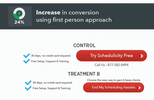
- Do not use second and third person in CTA copy – Always use first-person while wording your CTA. Make it personal to the users, actions that they must do themselves to solve a problem rather than being told to do. The best way to do that is by replacing all “your” in your copy with “my”. According to a test conducted by Schedulicity, using “my” increased conversions by 24 percent.
- Do not use complex words – Go for simple language that effectively communicates what the CTA is about. Do not use flowery language or some complex verbs. Remember, simple to understand words work wonders in CTA.
- No sense of urgency – Always word your CTA to incite urgency within your visitors. The CTA language should motivate them to take action NOW.
- Not specifying benefits – Users must know that the CTA will add value to their lives and benefit them. So, spell it out clearly, so they know what is going to happen on the other side. For example, instead of “Click”, use “Start My Free Trial”.
Always consider the stage of the funnel your visitor is at before wording your CTA. For example, if you are convincing your users to join a paid course, writing “JOIN Now” in the beginning is not going to work. Your users are new to you, so they need to be nurtured along the way before they are ready for the final leap. So, depending on the stage of the funnel, tailor your CTA language to match what you are asking them to do.
You can also use microcopy to guide your users on how to use your main CTA. New to you visitors should not have any confusion about how to proceed to navigate your website.
As always, conduct A/B tests to experiment with your CTA language and come up with effective ones your users are more likely to click on.
Call to Action Optimization Mistake #5 – Your CTAs Are Not Mobile-Friendly
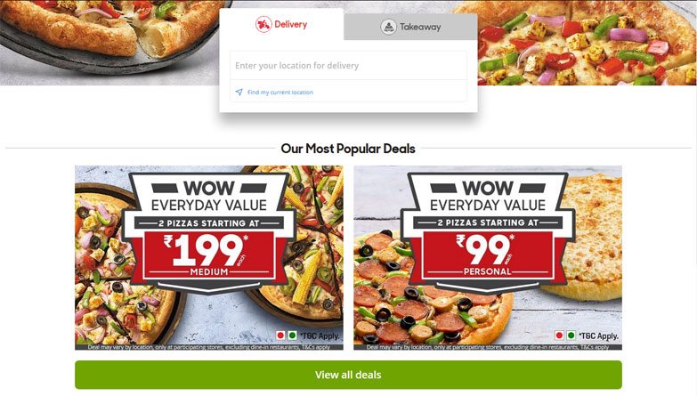
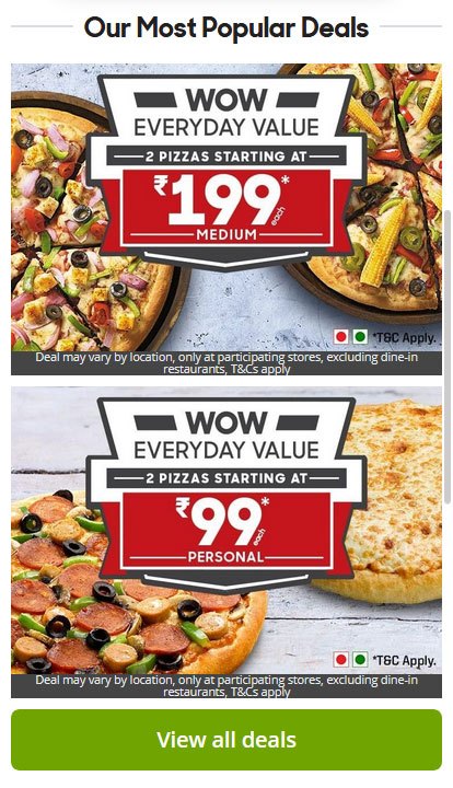
The majority of internet traffic comes from mobile devices, and if your CTAs are not optimized for them, then your website is doomed.
The mobile devices have very less screen real-estate compared to a PC, so you have to keep the mobile version of your website clutter-free for easy user access.
Did you see the difference between the above images? The app version has a simplified menu to better suit the small screen of mobile devices.
Depending on the volume of your landing page content, make sure to repeat your CTA several times on your site’s mobile responsive version. Users won’t bother to go through the entire thing to look for the CTAs. Instead, repeat the CTA once after a few paragraphs for helping visitors take the actions without having them to scroll down till the end of the content.
To facilitate easy access to your CTAs, increase the button size and leverage the surrounding white space to make them noticeable at once.
According to BigCommerce, mobile e-commerce sales will amount to 54 percent of the total e-commerce sales by 2021. Mobile spending is growing with leaps and bounds, and if you want your website to become successful, then your CTAs should be optimized for all mobile devices without any further delay.
Call to Action Optimization Mistake #6 – You Are Not Spelling Out the Benefits
Your CTAs will work only if they add values to your customers’ life. If users don’t understand the profound benefits properly, they are going to get by opting it in; then they won’t convert.
Your CTAs should spell out precisely what are the benefits they are going to add on. Explain why what you are providing would be of value to them. Don’t just tell them that the advantages are valuable; list the sheer benefits for the users to judge for themselves. Clearly explain why the benefits are worthwhile and what outcomes to expect as a result of taking action.
Use your words to motivate your users by letting them know what they will get from the CTA. Your products and services are there to offer a solution to the users’ problems. So, highlight their pain points and then specify how your items are going to solve them.
Don’t just stop at one benefit. Expand on the variety of benefits your products can offer. Make your users sit up and notice what you are offering so that they get compelled to click on the CTA and convert into paid customers.
Apart from listing down the key advantages of your goods, you should also showcase the social proof, review ratings, recommendations, and testimonials of your product close to your CTA to earn more customers’ confidence and thus increase the sales conversion rate.
Call to Action Optimization Mistake #7 – Your Copy is Not Up to Par
Your content is what entices your user to click on the CTA. If your copy is not convincing enough, then your CTA is not going to work.
Your content should make a compelling case of why your users should go for that action. Clearly outline their problems and needs and how the CTA is going to solve all of that with just one click.
Don’t jump the gun and start with the CTA. First, provide your users with the necessary information and value-adding content that will help them build up their mind whether your CTA is worth it or not. So, always repeat your CTA a couple of times below the fold after including informative content like a written copy, images, infographics, video snippets, etc.
Here are some additional dos and don’ts that you should follow while writing your copy.
- The tone of your CTA should always align with your copy. If you are using a professional tone in your copy, then don’t add informal CTAs.
- Never advertise what you can’t deliver. Do not keep any ambiguity in your copy; clearly spell everything out.
- Create urgency in your copy that primes the user to act NOW. This gives users less time to reevaluate their decision and back off without converting.
- You can provide initial discounts at the beginning of your copy to hook users’ interest to make them read further and finally convert.
- Provide free resources like eBooks, email courses, free trials, etc. to gain your user’s attention and fuel the leads funnel.
- Keep nurturing these captured potential leads through newsletters, free content, and consistent communication. They are bound to get convinced for a sale after a certain point.
Wrapping up
So, there you have it guys, 7 principal reasons why your Call to Actions are not performing and what to do to fix them. So, if you want to fix the CTA optimization problem of your landing page, these are the points to keep in mind while making the changes.
- Reduce the variety of CTAs on a landing page
- Position and repeat your CTA properly
- Design your CTA and make it stand out from the rest
- Use strong Call to Action words
- Make your CTAs mobile friendly and responsive
- Highlight the key benefits, plus showcase the testimonials
- Improve your landing page copy
I hope you enjoyed the article. Comment your CTA woes down below and the solutions you came up with to fix them. I would love to know more.
An advanced All-in-One Digital Marketing Course.
Mentored by Mr. Soumya Roy, the Founder, CEO of PromozSEO Web Marketing Academy.
- Reasons Your Business Needs to be on Instagram - September 16, 2021
- 7 Reasons Your Business Should Invest in Professional Content Creation - August 12, 2021
- 5 Ways You Can Improve Your Website’s Existing Backlinks - April 30, 2021

